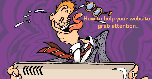
Why do web designers ignore aesthetics in favour of big traffic figures?
The web IT types love the technological intricacies of optimising a site. The clever tactics in fooling google but these geeks, these programming storm troopers, are so intently focussed on their traffic figures, they show scant regard for design aesthetics. Web design is fast becoming the sole domain of these IT experts, who exhibit little or no questionable marketing nouse but oodles of clever technological tactics
“Get that phone number bigger” they cry, “get more content in there!” “play a video”, then they mention every product category (and variation of)… all on the front page! No wonder so many sites look like a Friday night ‘Comet’ ad’ of yester year.
What happened to design aesthetics getting the customers heart beating like a fat girl on a trampoline? A message with resonant insight, that fans the growing flames of desire for your product or service. What happened to the viewer being visually guided through a site like, a maitre d’ escorting a valued customer to his table. A planned order of delicacies to wet the reader’s appetite for the product feast to come. All in a style that’s engaging and coaxes you into delving deeper …dare I say to even relate to the brand and follow it through its social media links because they want to endorse the product, to identify with it, as a valid and beneficial choice they are delighted to share with their peers.
Surely this has to be a better solution than the veritable dogs dinner sites, which jam pack, everything into the first page like a low rent newsletter!It’s a pity these IT whiz kids don’t consider their potential customers with the same passion they have for ticking all the optimisation boxes…frankly I don’t care how many times a key word is repeated on the first page or that each page has the requisite 500 words text. To me all this is academic if the content is uninspired. Without style or content to get your teeth into and making no attempt to satisfy the appetite for information the reader had when with anticipation, he clicked on the domain.
Ironically all the ‘rules’ make me for one rebellious in response. If I hit a home page to be greeted with multiple offers and services screaming at me simultaneously, the key words flayed to death and 15 opportunities to call, email and twitter , I bounce out of there faster than an MP out of the jungle.
The same goes for library shots, I know they are cheaper and easily accessible but come on guys, is it too much to ask for bespoke imager specific to the brand, that delivers the message in an inventive, surprising way?
Many web outfits have a background in IT and are wizards at the technical functionality surrounding the site AND its irrefutable that analytics and technical savvy can give you the edge but please not at the expense of a core proposition, of brand positioning and good design that relates to your customers.Don’t be unduly swayed by traffic figures, it’s no good having 10,000 hits per month if your bounce rate is at 90% and your sales figures have just flat lined. Immediately check you message is correctly targeted and your site is interesting to read! After all why shouldn’t you have a little confidence in your customers they’re not googlebots, they’re people like you and me.
Carl Brady -MD Big Stick Creative Consultancy